FTL
PERFORMANCE // 2007
––––––––––––––––––––––––––––––––––––––––––––––––––––––––––––––––––––––––––––––––––––––––––––––––
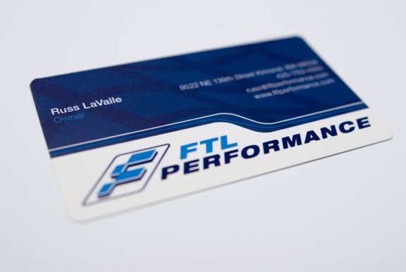
Two track racing junkies were tired of the high price tire maintence they were paying for and started a company for like minded junkies. I was asked to develop their brand to cater to these high speed minds. The logo feels like a track map and the pinstriping on the two-tone card is actually a diagram of the proper way to take a turn. Spot varnishes were used on the logo and turn diagram.
LOGO - STATIONERY
––––––––––––––––––––––––––––––––––––––––––––––––––––––––––––––––––––––––––––––––––––––––––––––––
![]()
––––––––––––––––––––––––––––––––––––––––––––––––––––––––––––––––––––––––––––––––––––––––––––––––