Craftstirs
A new approach from an unexpected place.
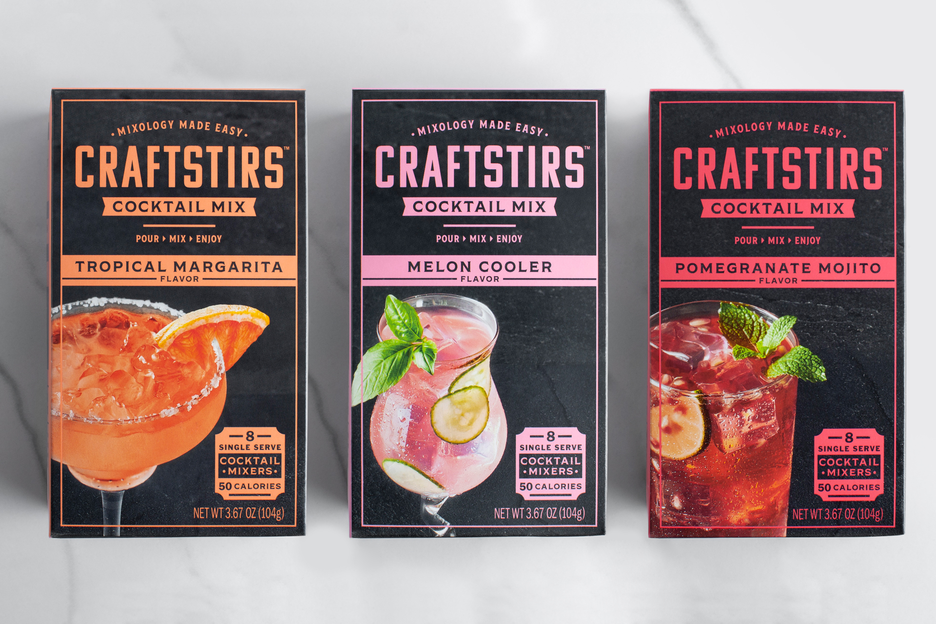
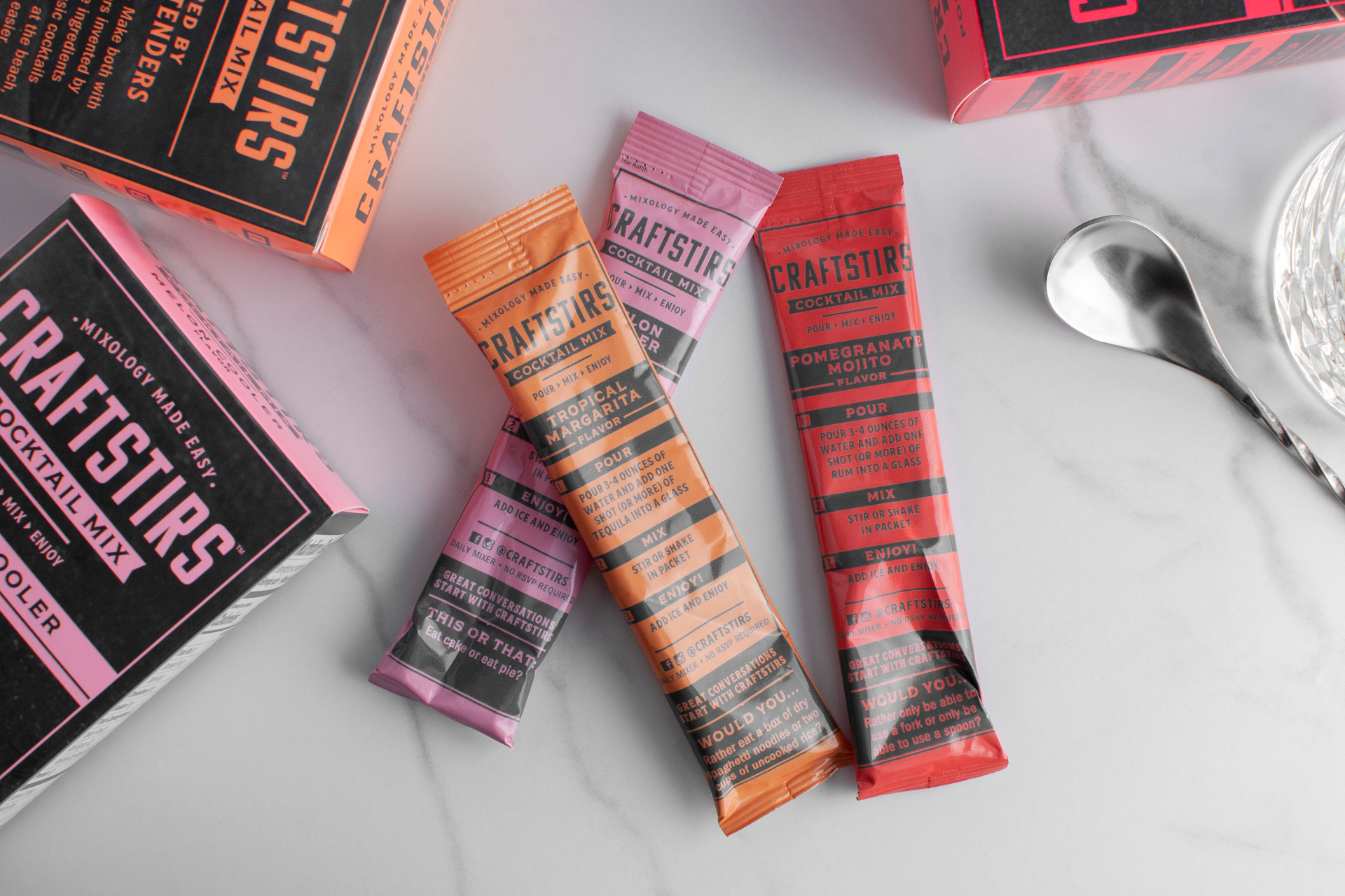
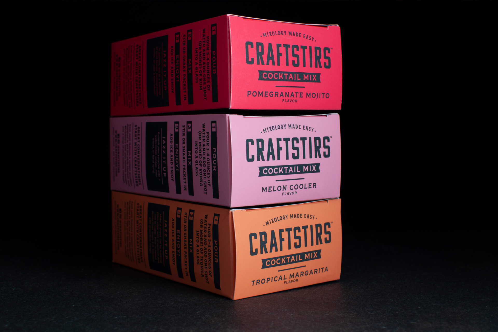
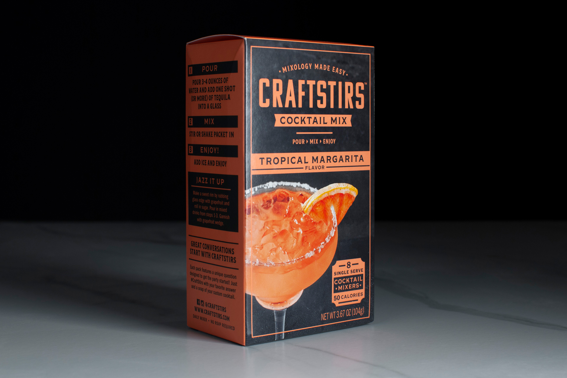
I was first hired by Craftstirs to develop design iterations of an agency concept for testing. In the process of applying feedback and repeating the tests with minimal progression, I proposed an alternative concept that ended up being the brand direction for this innovative single serve drink mixer company. Craftstirs was built on the strategy of on-the-go single serve convenience, but I felt the additional visual narrative of a speakeasy would help build a connection to history and tell the story of recipe collaboration with curated mixologists.
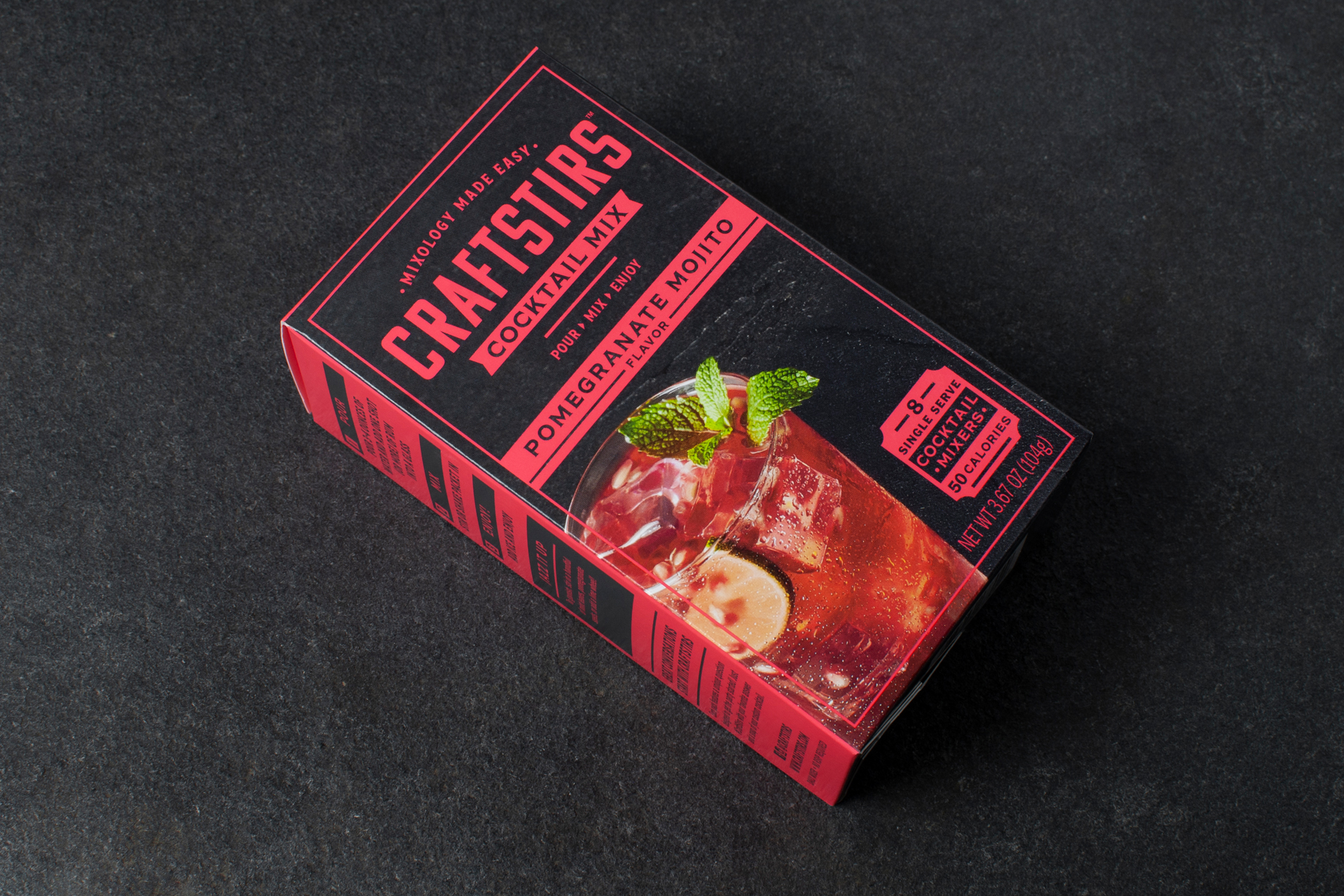
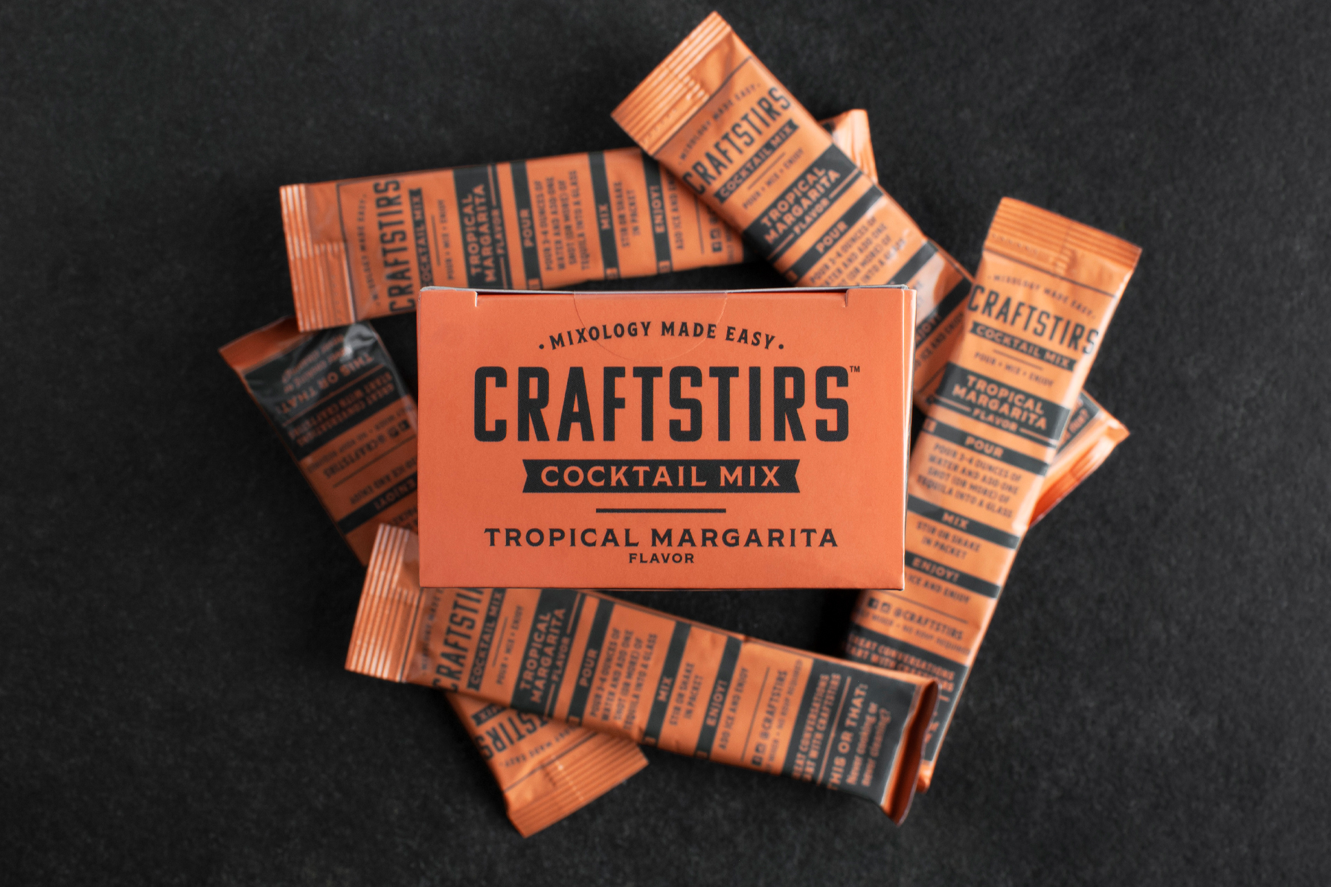
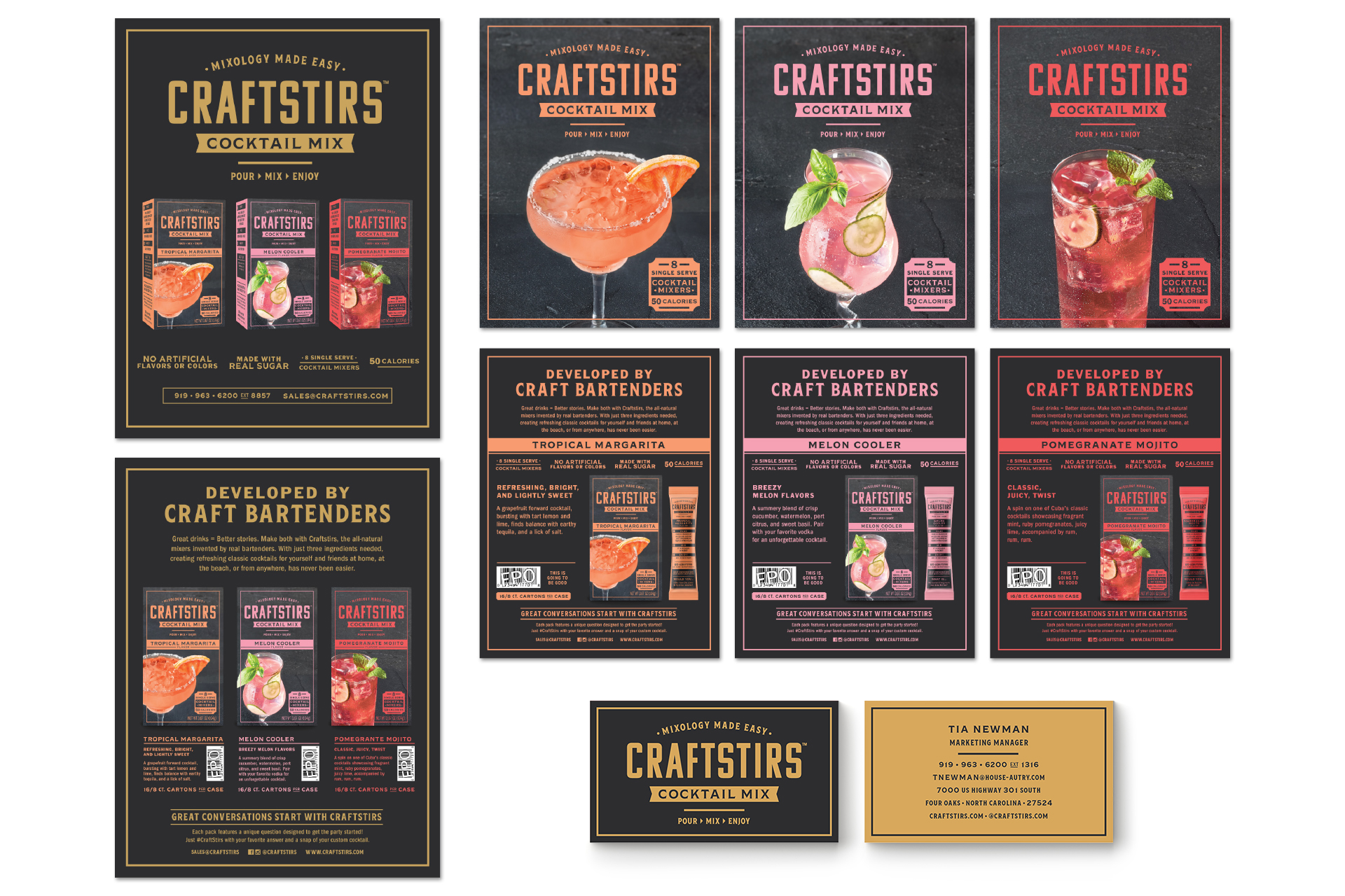
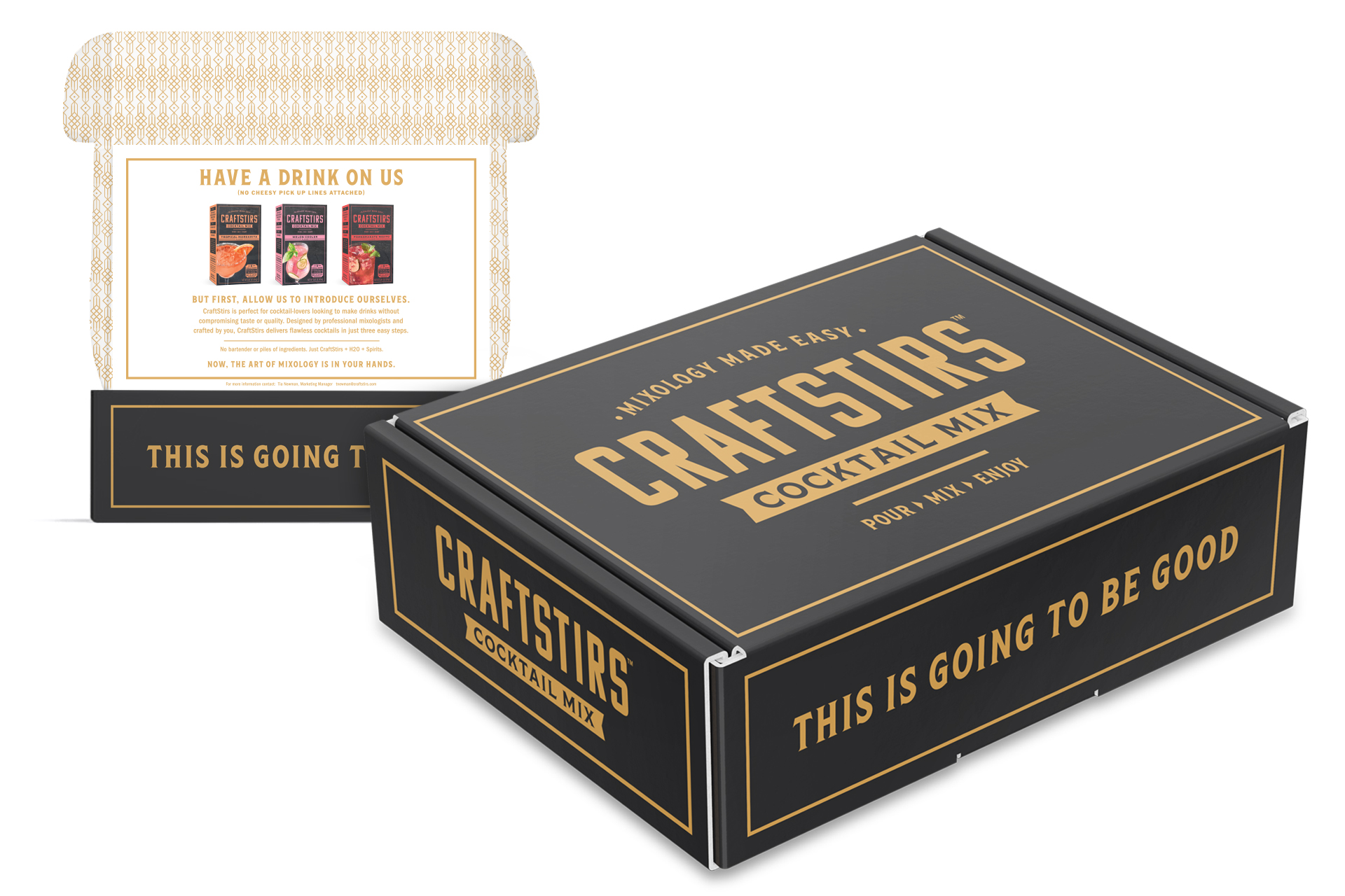
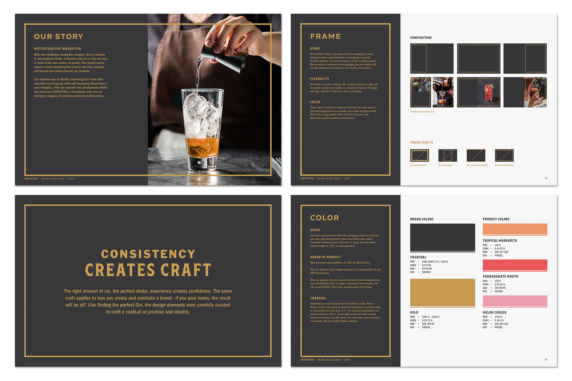
Using soft blacks, stone textures, gold details, and a contrast of poppy colors full of flavor expectation creates the brand visuals of Craftstirs. A look that can go either marble or stone, the flexibility of the brand system is created with key graphic elements to maintain a consistent brand language on and off packaging. A brand guide was created to guide strategy and application rules as well as sales sheets, business papers, sample kits, and digital presentation templates.
WHAT I DID
Brand Identity – Package Design – System Design – Brand Activation – Brand Guide