Caffe Lusso
Optimizing for efficiency, double shot of refresh.
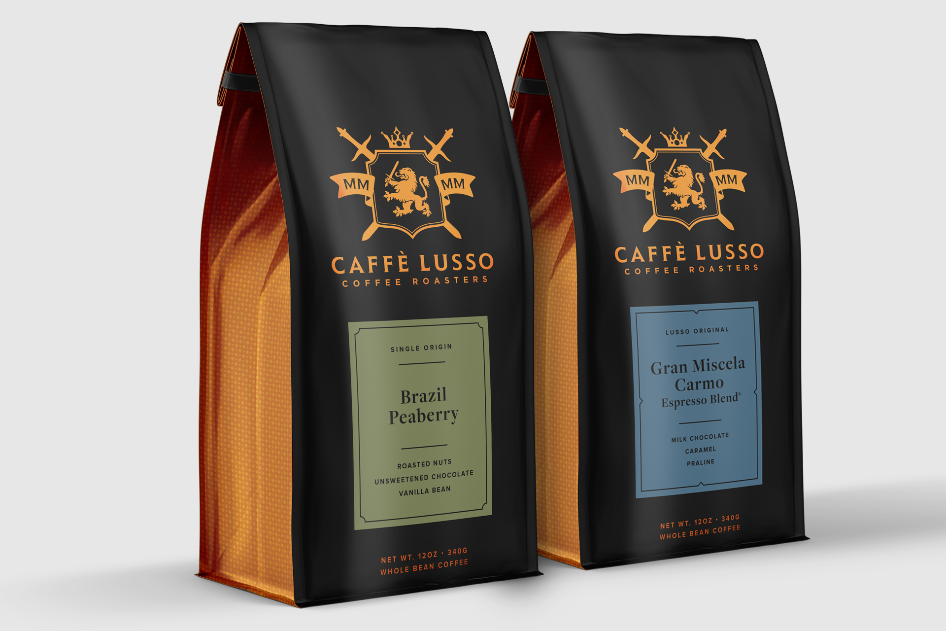
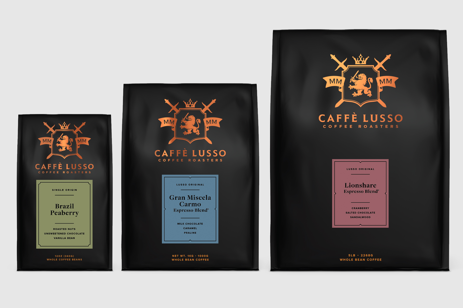
Caffe Lusso had a beautiful package that served them well for years, but was prone to problematic printing and labor-intensive for the packing line, I was hired to solve for both and in the process a refresh was born.
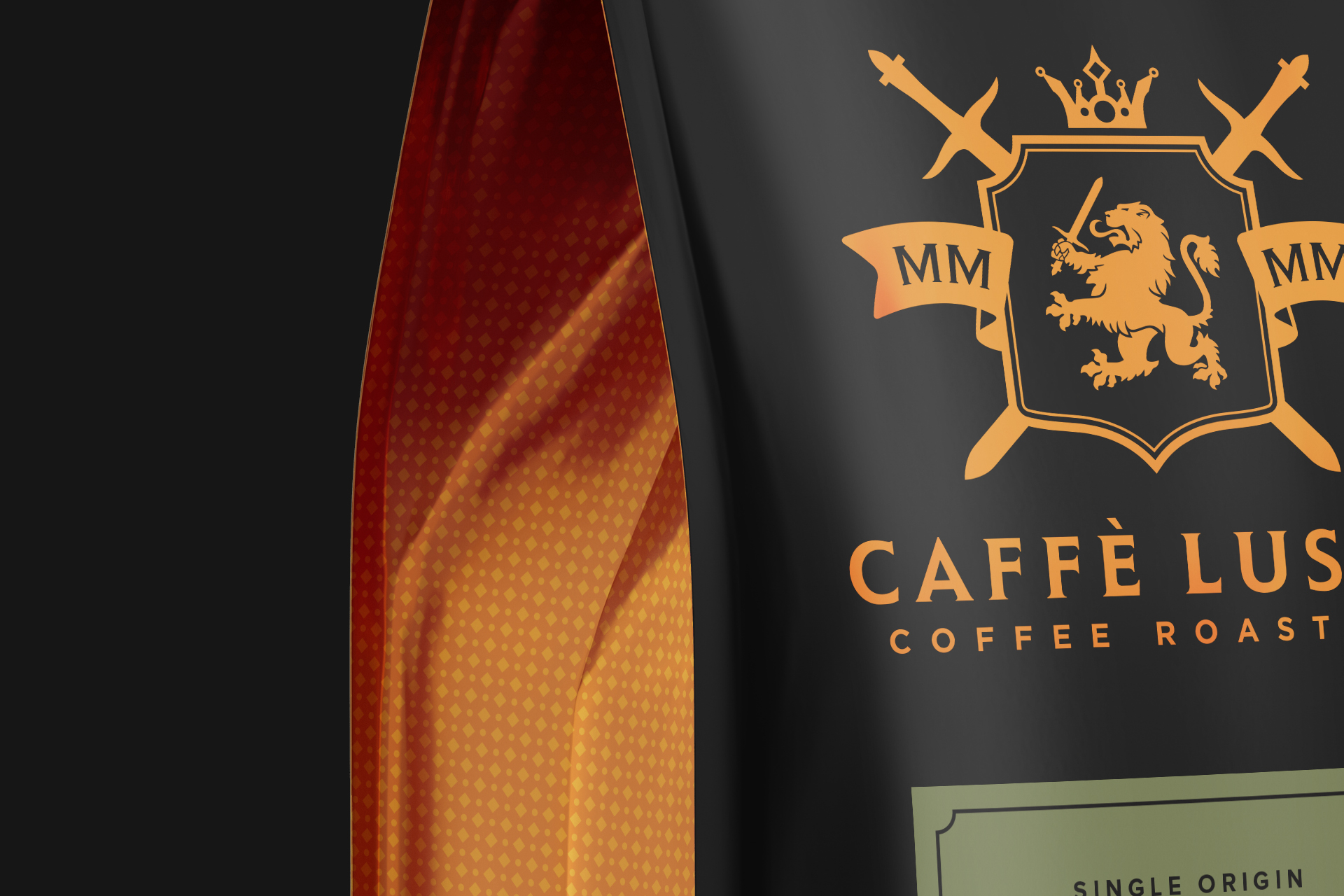
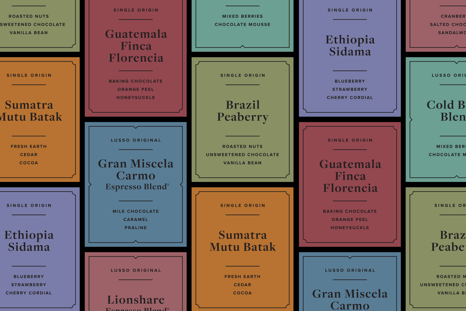
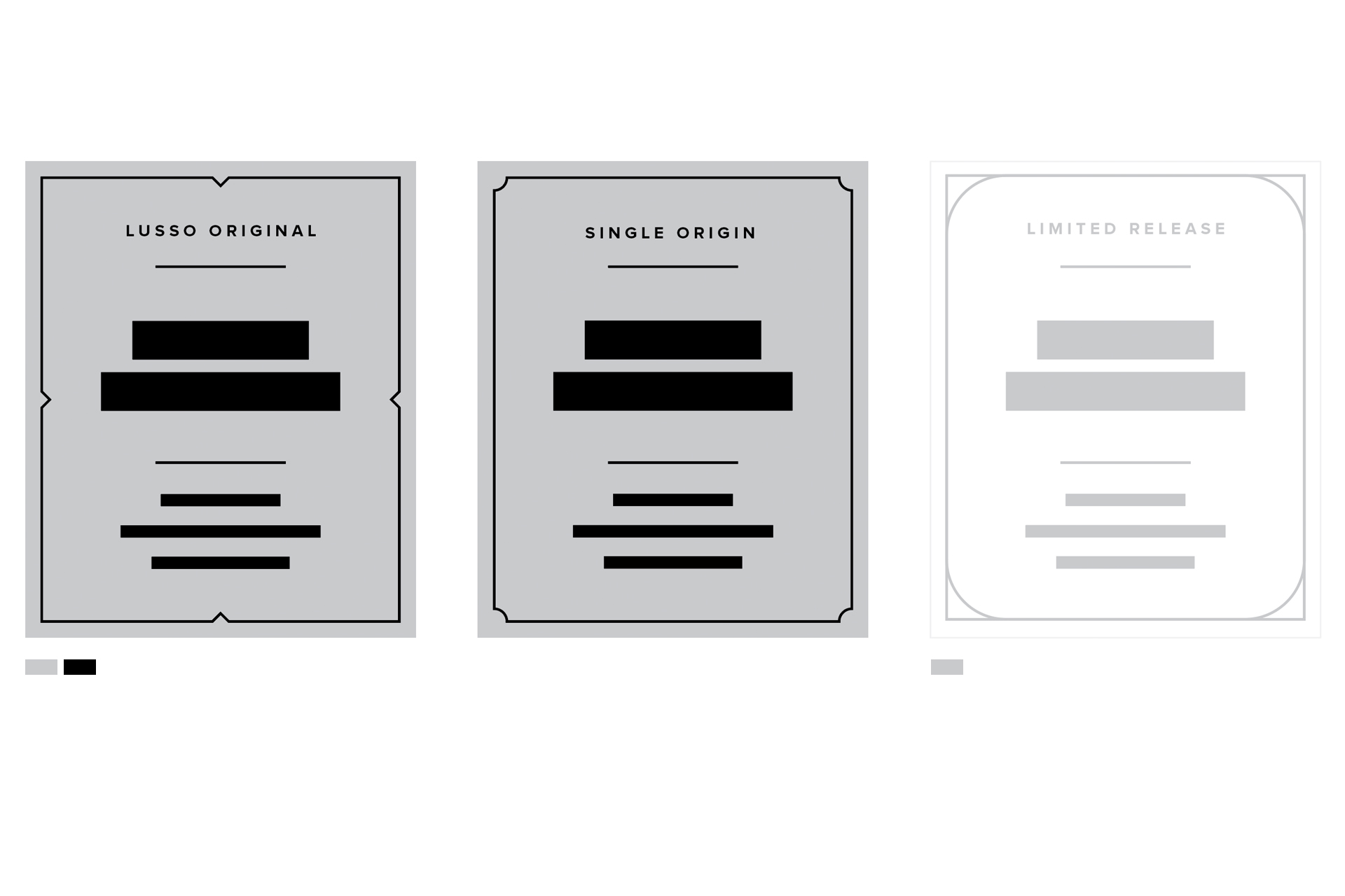
I approached the challenge first by reducing the design to its essential elements, reducing registry-dependent printing tricks and heavy ornamentation. The design evolved to a modern, minimal, and confident translation of the brand iterated across 3 bag sizes. To increase efficiency on the packing line and reduce multiple label printing costs, a 1 label system was created to work on all bag sizes. To separate Lusso’s 3 tiers of products, a unique border was used to separate Single Origin, Lusso Originals, and Limited roasts. A new brand pattern was also created for the bag gusset to compliment the details of the logo and add another tool for brand communication.
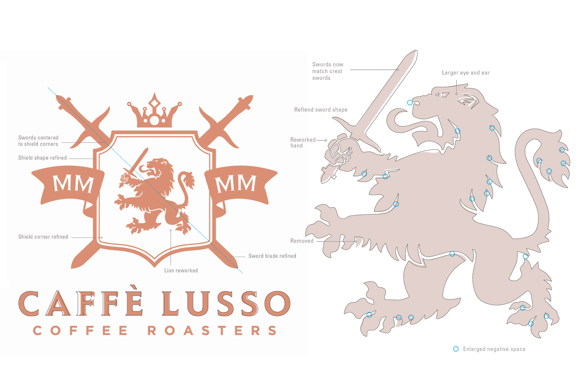
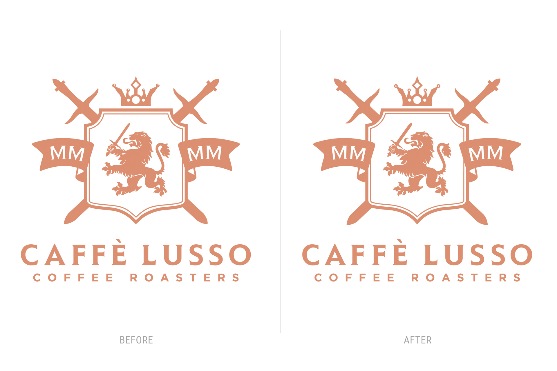
In the process of the project I noticed problematic areas in the logo that would not translate well printed or display digitally at small scale. My thoughts were well received and I refreshed the brand identity reshaping forms to increase contrast and fine-tuned the typography.
WHAT I DID
Package Design – Label Design – Label System – Logo Refinement – Brand Refresh – Print Production


